Having worked in marketing for over 20 years, I think I’ve seen it all. But there’s one situation which stands out as the contender for the most awkward.
It’s that moment when they open up an email with a smile like a proud new father, clearly thinking they’re about to unveil the next Nike Swoosh or Apple apple. But what I’m presented with is something that looks more like it was designed by a 10-year-old. And then I realise that they are waiting for me to say something nice.
The worst part is it’s never just a poor logo designed by some other agency. No, I then find out it was designed by their son who took GCSE art, their wife who “used to run an upholstery business” or the client themselves – who, in their infinite wisdom, always “thought they had a creative streak” and “really should have done a graphic design course in college.”
Although I’d like to tell them, “Your logo looks like it was designed on a beer mat after a few too many pints,” I’m a professional. So, I have to handle the situation with a degree of tact and finesse.
So how should you approach the dreaded “bad logo reveal”? Well, it’s never easy.
Step 1: Smile, nod and try not to laugh
Always smile and nod. It’s never a good look laughing at your client’s efforts. Maybe say something like, “I can see you’ve put a lot of effort into this,” but never say “Wow!” or “This is brilliant!” because it’s always best not to lie.
Maybe say, “You’ve certainly got some ideas in here, which is great!” because vague compliments may well avoid crushing your client’s dreams and will certainly buy some time.
Step 2: Look for any way out
Scan the logo for any redeeming quality. Maybe the colours are “nice”? Maybe the font is legible? It may well be awful, but don’t lose hope – there are always some small things you can salvage.
“Okay, so… the colours are very, erm bold. I like bold.” This gives a moment to breathe and steer the conversation toward what could be tweaked in the design.
Tip: Always go for vague terms like “bold”, “different” or “unique” when describing a terrible logo. This allows you a little more time before suggesting that it probably needs a complete redesign.
Step 3: Subtly hint that logo design is probably best left to professionals
You now have to tactfully suggest that their logo might not be quite what they are after.
Maybe say something like, “It’s really great that you’ve taken ownership of your brand, but sometimes it helps to bring in a professional who can make sure your logo is truly going to represent the quality of service you offer.”
This sounds like you are being nice, but what you’re really saying is, “This is terrible, but don’t worry. I’m here to save you.”
Step 4: Offer them a solution
You’ve knocked them down, now it’s time to reassure them. Professional logos are a thing – they don’t have to stick with their family member’s first attempt at graphic design.
Maybe say, “The good news is, we can absolutely take your logo to the next level. Let’s talk about how we can create something that truly reflects your business, and I’ll make sure it stands out for all the right reasons.”
Step 5: Remind them they are not alone
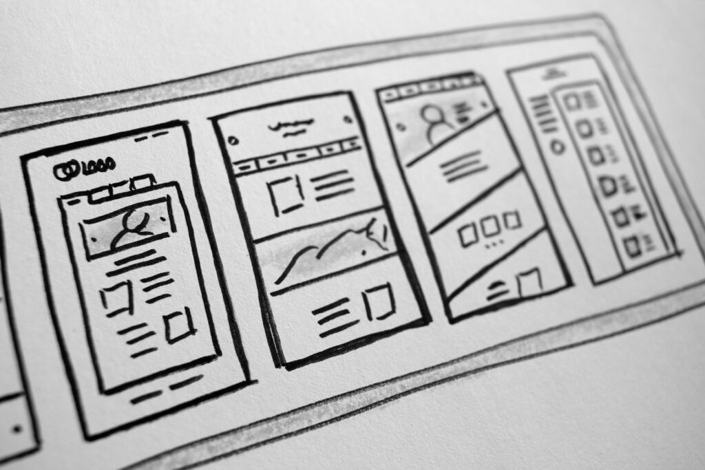
I’d like to say that this has only happened to me once, but I would be lying. I’ve seen this countless times. And not just logos. More often it is websites, which a family member “designed” for them. In these cases it is a whole new level of terrible that can be achieved. But there is always a solution.
Conclusion
Tact is everything. With the right touch, you can help them understand that their brand deserves better.
It is important to remind the client that their logo is more than just a pretty picture. It is one element of the company’s brand and so should always be considered as such. I often find that by talking the client through how they see their company, where they want it to be, I can talk them around and help them understand why it would be necessary to “review” their proposed logo design…
Want help with your branding? Get in touch. I promise to be nice!